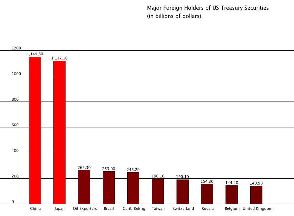
This week for Data Representation we were asked to create a simple graph or bar chart using Processing and raw data from the Guardian Data Store. The instead of hardcoding the data in, we needed to import a .csv file and iterate through it with a for loop to separate out the data into assigned arrays. I selected a data set of major foreign holders of US Treasury securities.
While this graph is nothing special to look at, this is a jumping off point from creating a static visual of data to creating an interactive data model. Plus, coding visualizations allows us to manipulate the data a granular detail. This allows for some very elaborate data visualization down the road.
The bar colors are not hardcoded; instead the amount of debt per country is mapped to the RGB color model, which allows our bars to increase in brightness as the amount of US debt held per debt holder increases. This is all achieved with a for loop.
Another powerful aspect of creating a bar chart in this manner is it’s very easy to use the bar chart as a template and apply another data set to it without a lot of code tweaks.
I hope to return to this bar chart and do something more interesting with the data in the near future.
The code for this bar chart can be found here.
As an aside, The Guardian provided their own data vis of the data. Here’s an interactive look at US debt held by location.