Summary
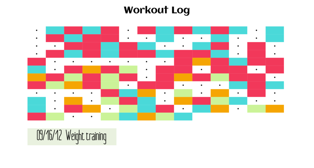
My Data Representation final revolves around personal data, specifically my workout schedule. I have been collecting the workouts I do on a daily basis since early July of this year. I have four different workouts that I do through out the week, and rest days peppered in. These workouts include running, weight-lifting, and two kettlebell routines.
While this data visualization is minor in scope, having my own data charted out is great way to reflect prior workouts. It would be great to mash-up other data here as well, like seasonal or weather data, and qualitative data such as my mood to see how that affects my workouts. I notice I do run less as the weather gets cooler.
Building it
FitnessSquares is built in Processing. I had two objectives:
- Display my data in a fun, easy to digest format. Color-coordinated rectangles do the job.
- Have a mouse rollover displaying the data and workout
The Processing sketch imports a .csv file containing my training data, and splits the columns out into date and workout arrays.
If were to expand upon this project, I would:
- Build an input to the sketch to add dates and workout entries instead of adding the data to a csv.
- Add dynamic behavior to the display banner. As of now, x & y-coordinates are hard-coded into the sketch. If more training entries are added, I would have to manually code the banner lower.
- Possibly add a key denoting which color corresponds to which workout type. As for now, I avoided this for two reasons: 1) minimal aesthetic 2) Doing a mouse rollover displays the workout type anyway.
- Think about reorganizing the grid. As of now, it’s 14 days per row. Perhaps it would be more insightful to see it in a typical 7 days per week system.
This project was inspired by Jax de Leon’s Visualizing Music and Katy Foster’s Cinema Redux.
The code is available here: github